
This Friday, Feb. 8th is the Desktop Publishing class at the Wickham Park Senior Center. In preparing for this class I have run across many great articles that just need to be shared! So if you are a fan of desktop publishing with Microsoft Publisher or if it’s all new to you; you’re bound to learn something so read on!
--------
This article is located at http://www.printingforless.com/Microsoft-Publisher-Design-Tips.html
Professional Printing Results with Microsoft Publisher
I'm going to make the bold statement:
"You can get the same professional printing results using Microsoft Publisher, a program that many people already have on their computer or can obtain for only about $140 as you would get by using the far more expensive Adobe Indesign or Quark XPress."
And I'm going to tell you exactly how to do it in this article.
All layout/design programs do essentially the same thing; they allow you to position text, photos, clip art and other elements in a document which is generally destined to be printed on some kind of media such as paper. And the secret here is that Publisher is equipped to do all these things just fine. In addition, we've found that it's much faster to learn than the more expensive programs.
Since we began, PrintingForLess.com has been the printer for tens of thousands of small businesses who have chosen to use Publisher to create their marketing pieces. And what we've learned in over 10 years of experience is that if you avoid some very common pitfalls you can create a very effective, professional looking marketing piece for your business. We'll focus on how to overcome these pitfalls while using Publisher.
Planning
Before you fire up Publisher and begin to add pictures and text to a layout, consider doing a little planning and idea development first. Brainstorm with your team exactly what change in thought or behavior you desire to create in those who view your piece. What story are you telling? What bold premise are you putting forth? What call to action are you building into your marketing piece? Get clear on these questions and then sketch on paper some possible ideas for how to attain these results before you begin the actual layout.Images
After you do the above mentioned planning it's time to obtain whatever photographs your piece requires. Two of the largest mistakes that we see with photography are:- Using haphazardly produced or pre-existing photographs simply out of convenience instead of obtaining exactly what your planning process calls for
- Poor lighting or low resolution
It's not important to convert your photographs from RGB to CMYK since Publisher stores them as RGB anyway. At PrintingForLess.com our RGB to CMYK image conversion process is state of the art and will yield the most accurate possible results.
Logos, diagrams, clipart, etc.
Many marketing pieces require a company logo or other types of images which are not photography. The main thing to avoid here is using artwork which was obtained from a website. It will be much too low in resolution and will look fuzzy or blocky on the edges. Use original artwork which is 300 dpi or greater in resolution or even better, is still in a native format which is vector.
Please call us about this part of your design process if you have questions. We have highly trained creative and technical people with libraries of such artwork who can help you get what you need inexpensively or perhaps even free of charge.
Create the layout document
Create your layout document in Publisher at the trimmed, finished size of the piece. If the piece is folded use the layout guides tool to create "Grid Guides" to indicate where the folds are and also where the center of each fold panel is. In other words, for a three panel, folded brochure, create six columns. The Grid Guide in the center of each column will make it much faster to accurately center the images, text and other contents of each panel.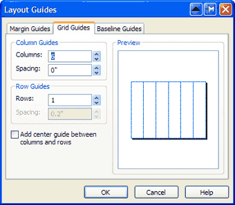
You can find the Layout Guides tool under the "Arrange" menu item.
When positioning text and images in a column, if you select an object it creates "handles" on the corners and sides of the object which you can use to stretch it. To perfectly center all your layout items select and nudge each object so that the center top and bottom handles line up with the grid guides you created.
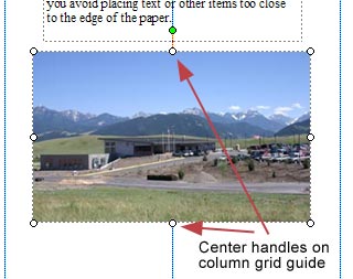
In general, if you use actual measurements, guides and other tools to position your layout items instead of merely "eyeballing" their positioning you will be certain of creating a more professional looking layout. Margin guides can be set to .125" to help you avoid placing text or other important items too close to the edge of the paper.
Feel free to use one of Publishers premade wizard templates if you have a hard time getting your ideas to flow into a blank sheet of paper. When using these templates you will simply substitute your text and graphics for what is in the template.
Color Selection
Printing with ink is about color—and everyone has fun picking the colors for their text, panels and other design elements. Two very common mistakes are:- Selecting colors directly from the color picker within Publisher based only on how the color looks on screen
- Picking colors using the RGB color space
The answer is to pick your color formulas from an ink and paper color guide. If you do this the colors in your printed piece will be just what you expected. Two very good sources of ink and paper color guides are:
- Pantone CMYK color swatch books
- Free PrintingForLess.com design guide we enclose in every pack of printed samples sent to anyone who requests one
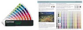
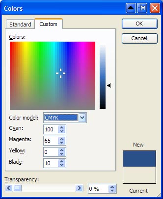
After you have selected your layout colors from one of these color guides set up the cyan, magenta, yellow and black values in the color selector in Publisher, be sure the Color Model is set to CMYK as indicated below:
Fonts, Fonts, Fonts
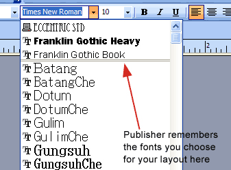
A common mistake is to use too many different fonts within a layout. It's fun to pick fonts that call attention to and uniquely highlight each section of your layout. But to most viewers, using too many fonts will look busy, tedious or just plain goofy. Instead, choose a single font family (includes a plain, bold, italic, etc.) which is somewhat conventional and easy on the eye for most of the informational text in your layout. So called "serif" fonts such as Times New Roman, Bodoni and Garamond have proven to be easiest for the eye to read in paragraph text. And if your layout can benefit from some playfulness by all means select and use a different, unique-looking font for a headline or other attention-grabbing section.You'll find that as you begin to put text into text frames in Publisher the program remembers your "palette" of selected fonts and conveniently positions your selected fonts at the top of the font selection dropdown. This makes it easier for you to quickly select from your "chosen palette" of fonts as you build your layout.
Grouping Elements
After you have a section of your layout positioned very precisely, it might be a good idea to select all the items (hold down the shift key and click on each one) and then group them together by pressing the "group objects" icon located directly below the objects you've selected. This will lock them together in their relative positions. This is especially useful if you will need to duplicate this configuration somewhere else in your layout; copy and paste the group to another page and you will have perfect consistency throughout your layout.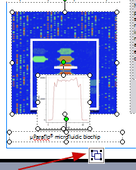
Use Master Pages for Common Backgrounds
If your design calls for a consistent background color, company logo in the corner of each page or some other consistent design element on every page, don't waste your time doing it manually. Open the Master Page (View...Master Page) and carefully place the repeating elements here. Uncheck Master Page and you'll be back in normal (foreground) view—except the contents of the Master Page will now be in the background of every page in your layout. This is a great tool when you are creating many identical business cards for people in your company. Create a multi-page document and put the logo and other common elements on the Master Page. Each employee's contact info is the only data on the foreground layer of each page which is much easier to manage.Spell Check
There is a good chance that the spell checker is already on and making spelling suggestions as you type in Publisher. But it would be a good idea to manually run the spell checker (Tools...Spelling) so that you can consciously review any remaining spelling/grammar issues before sending your layout to a commercial printer.Print a Hard Copy
Print several copies of your finished layout on a desktop printer and read one as though you are seeing it for the first time. Get a couple of your detail-conscious friends to proofread and review the layout. You'll be surprised at how you might perceive the layout on paper vs. on-screen and you'll probably find some mistakes that you were unaware of when viewing on-screen.
You've probably noticed that some of these suggestions aren't specific to using Microsoft Publisher—and you're right. The majority of regrettable and less than professional issues we see with layouts created by those who are not design professionals; and not the fault of the software they used. It's simply the lack of a checklist-something that airline pilots use every flight. If you use this short guide as a checklist each time you create your own designs, you'll consistently gain superior results and feel proud of your work.
-----------------again thank you to www.printforless.com for the above article----------------------------
AND DON’T FORGET:
Simply Seniors Computer Tutor will be teaching Microsoft Desktop Publisher Friday Feb. 8. 2011. For more information dial 321-431-3866. Class is only $10 registration is required!
No comments:
Post a Comment